Want to show change in biomass across a paddock, or an area, quickly and simply over time? You can using our NDVI chart widget in FarmLab Analytics
The NDVI Chart Widget in analytics offers a convenient and user-friendly method to analyze biomass changes over time for one or multiple paddocks using surveyed NDVI data. Follow these steps to utilize this feature:
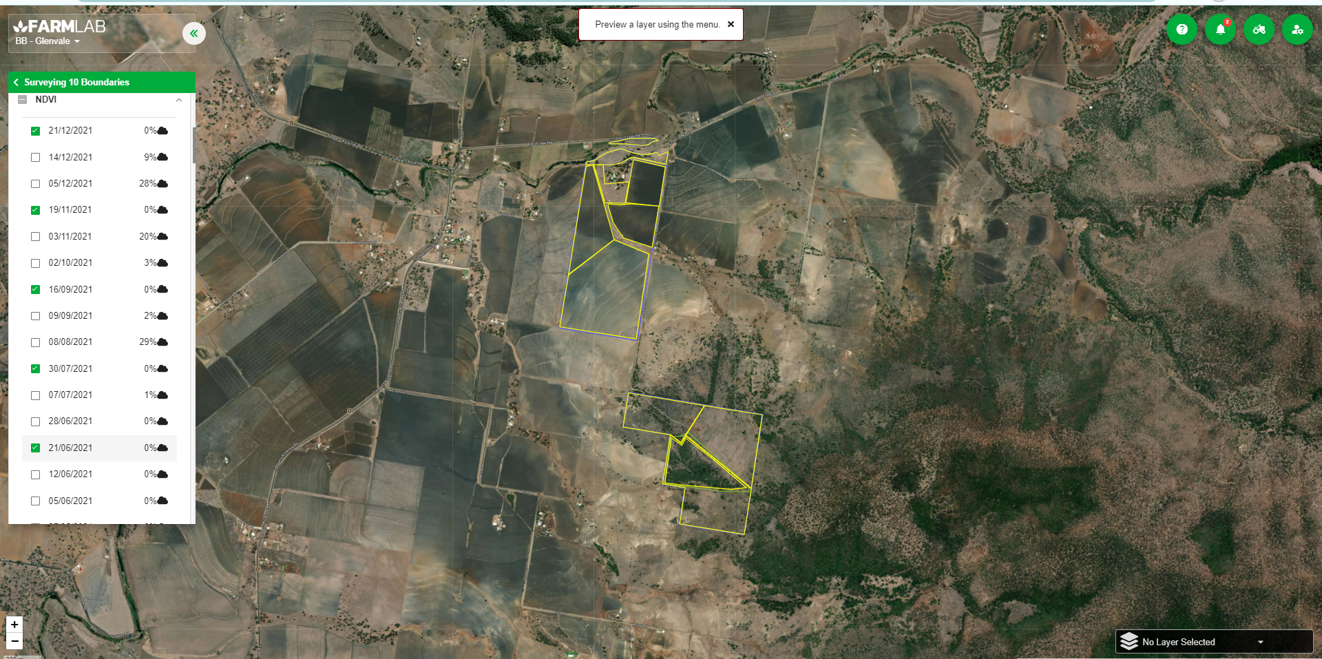
1. Begin by conducting a farm survey and select the desired NDVI dates for analysis.
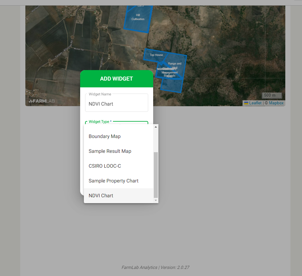
2. Once the survey is complete, access analytics and create a report. Include the 'NDVI Chart' widget in this report.
3. Configure the report by choosing the specific farm you wish to examine biomass data for, and select the desired display dates. The corresponding mean NDVI values for each date will be shown on the graph, delineated by their respective boundaries.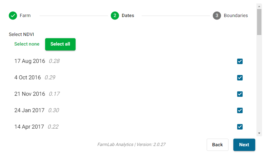
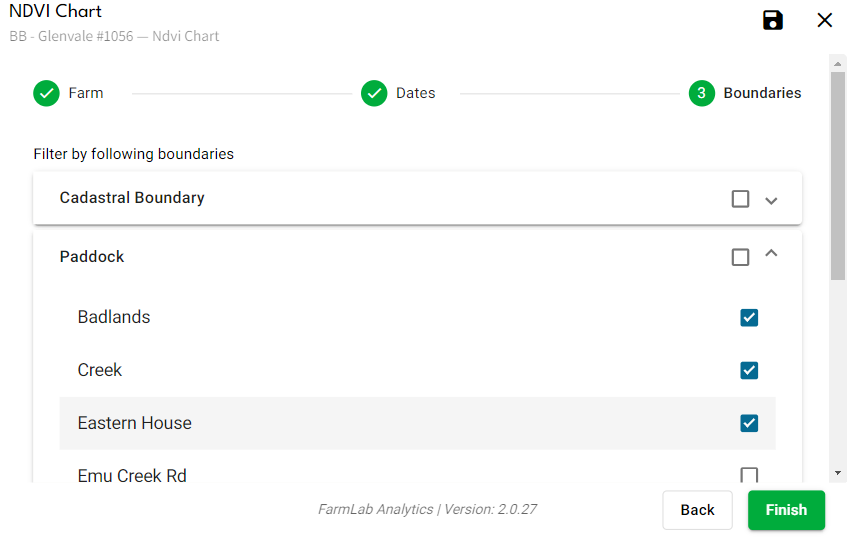
4. Select which boundaries you want to include within the chart. The final chart will plot mean NDVI values for each selected boundary.
5. On the chart itself, you can toggle individual boundaries on or off by selecting their names from an accessible menu.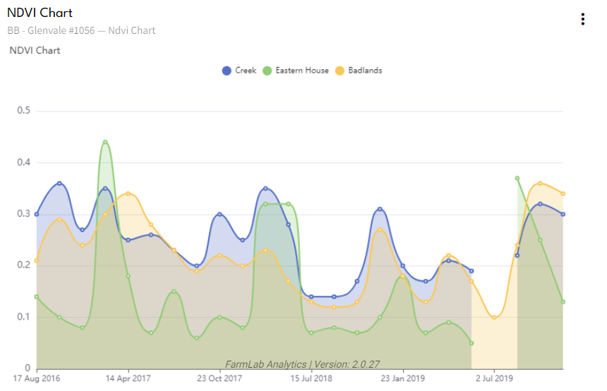
Additional Recommended Uses:
- Analyzing production potential of strata: By creating strata based on soil types within FarmLab and transforming them into boundaries prior to surveying, you can assess production potential for each stratum using the graph's information — either within a paddock or across your entire farm.
1. Begin by conducting a farm survey and select the desired NDVI dates for analysis.
2. Once the survey is complete, access analytics and create a report. Include the 'NDVI Chart' widget in this report.
3. Configure the report by choosing the specific farm you wish to examine biomass data for, and select the desired display dates. The corresponding mean NDVI values for each date will be shown on the graph, delineated by their respective boundaries.
4. Select which boundaries you want to include within the chart. The final chart will plot mean NDVI values for each selected boundary.
5. On the chart itself, you can toggle individual boundaries on or off by selecting their names from an accessible menu.
Additional Recommended Uses:
- Analyzing production potential of strata: By creating strata based on soil types within FarmLab and transforming them into boundaries prior to surveying, you can assess production potential for each stratum using the graph's information — either within a paddock or across your entire farm.
- Determining variability between seasons for the same crop: By comparing NDVI data from peak biomass months for a particular crop across different years or seasons, you can evaluate the impact of management practices or inputs on its performance. This is especially useful to assess trial effectiveness, where crop growth (measured by NDVI increase rate) can be compared to previous seasons (assuming the same crop type was planted).